
- within Tax topic(s)
- with readers working within the Banking & Credit industries
"Typography matters because it helps conserve the most valuable resource you have as a writer—reader attention." Matthew Butterick — Typography for Lawyers.
Lawyers, especially appellate lawyers, spend a lot of time on content and organization. But often when it comes to font and other typographical issues, it is easy to settle for the default—like Times New Roman, bold a few headings, and call it a day. Lawyers often perceive this as the "safe" choice.
Typography is more than what font you choose and could take up an entire book. In fact, Matthew Butterick has written a very good book on it, large portions of which are available free online.1 But carefully selecting font is a part of good typography, one that an effective advocate shouldn't neglect.
Earlier this month, the Seventh Circuit chose to publish a decision for, among other reasons, one attorney's choice of a bad font and "to urge all lawyers to read and follow this circuit's Practitioner's Handbook for Appeals (2020 ed.), which is available on the court's web site." AsymaDesign, LLC v. CBL & Assocs. Mgmt., Inc. What prompted this statement? Well, the attorney used "Bernhard Modern" for his brief, a font the court observed was "suited to movie posters and used in the title sequence of the Twilight Zone TV show." The court actually used the font for part of its opinion to illustrate how unreadable and distracting it was:
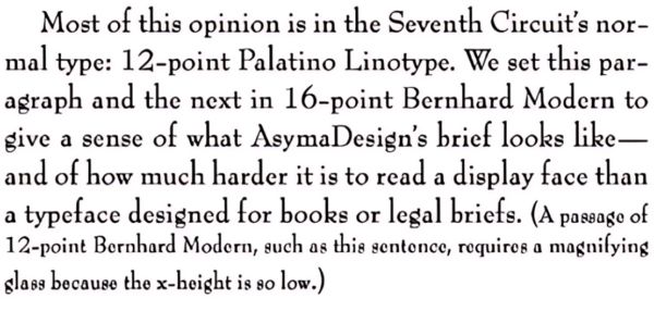
Several practice tips can be gleaned from this opinion. Some of it is obvious like, "don't use comically bad fonts" (e.g, Comic Sans) and "pay attention to court rules on format and style"—especially when a court like the Seventh Circuit provides a 200+ page manual with seven pages devoted to fonts alone.2 The court also referred litigants to Typography for Lawyers as a resource.
In addition to the obvious, several additional technical points are worth mentioning for the legal writer. The court didn't simply criticize the font used, but explained what goes into a good font for appellate briefing. The court emphasized its Handbook's guidance on selecting "type-faces (often called fonts) suited for use in books and other long-form presentations." Examples given by the court include Century Schoolbook and Bookman Old Style.
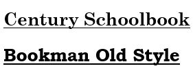
Generally, "[a]ny face with the word 'book' in its name is likely to be good for legal work." The court additionally encourages advocates to ditch fonts in the Garamond and Times families in favor of the Century and Bookman families because the latter contain taller lower-case letters (called "x-height") making them easier to read.
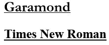
What's wrong with Times New Roman? Well, nothing per se. After all, it is the default choice, and the author has used it in numerous court submissions. But it can be boring. Butterick has a strong negative reaction—"When Times New Roman appears in a book, document, or advertisement, it connotes apathy." While perhaps a bit overstated (Times is perfectly serviceable and time-tested), it's worth considering the other options out there.
Most advocates will be limited to the fonts available on their computers, or "system fonts." Butterick's book has an excellent section on these system fonts (even though he is selling his own "professional" fonts)—although he does include Garamond as one of the preferred fonts, which the Seventh Circuit doesn't recommend.3 Consistent with the court's observations, Butterick notes that picking a font used in printing books and other longer content is a good start. The takeaway is that there are plenty of good system font alternatives to Times.
Butterick also discusses "professional fonts," or fonts you must purchase, which he recommends. In addition to potentially elevating the appearance of an advocate's writing, Butterick observes that the available system fonts, in contrast to professional fonts, are generally optimized for screens, which is not always ideal. These fonts certainly aren't necessary, but they're worth considering.
So why should an appellate lawyer care about something as mundane as font? Reader attention is a finite resource that you should steward carefully. Butterick says "[w]riting as if you have unlimited reader attention is presumptuous because readers aren't doing you a favor." He urges advocates to consider that writing is not a "hobby" for judges. "It's their job. ... Your judge has not set aside your motion for summary judgment so she can savor it during her upcoming vacation to Maui. More likely, it's just one document in a pile of hundreds, all competing for her attention."
Just as it is important to write clearly and concisely, it is important that the appearance of what you write preserves your audience's attention on the merits of what you have to say. The last thing a lawyer wants is for what he or she writes to be remembered for how closely it resembles the opening credits of The Twilight Zone.
The content of this article is intended to provide a general guide to the subject matter. Specialist advice should be sought about your specific circumstances.
